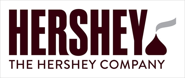
The Internet has been buzzing about Hershey’s new logo, and not necessarily in a good way. The redesign is a key part of the 120-year-old company’s wider rebranding efforts.
In an effort to expand its identity beyond just chocolate bars and to attract a broader customer base, The Hershey Company is moving away from the 3-D styling of its old logo to a simpler and more modern flat design.

But the brand's new emblem has been the brunt of many jokes on social media because of its striking resemblence to a popular emoji.
Hershey’s hires a design firm to design a brand new steaming pile of poo. http://t.co/lkTC35txKdpic.twitter.com/uqgOMsrfnb
— Jared Spool (@jmspool) August 28, 2014
Wow, @hersheys are really going for accuracy with their new logo! http://t.co/sH6NJMkzrypic.twitter.com/yB126vKm3i
— Chocablog (@chocablog) August 30, 2014
Mike Wege, chief growth and marketing officer at Hershey, said the company is trying to focus on offerings other than the chocolate bar: “We have an amazing portfolio of iconic brands in confectionery and snacking. Our updated company brand and refreshed visual identity is an expression of our progression to a modern, innovative company.”
Hershey will also incorporate a new “disciplined visual identity system” based on the recognizable color schemes of some of its most successful brands, including Reese’s and Jolly Rancher.